Mastering Colour Science: The Invisible Hero of Product Design
- Jul 24, 2025
- 1 min read
by Dr. Abhishek Gilara
In the world of product development, colour is far more than decoration—it’s communication. It's the first silent language a product speaks before its features are even explored. A person may never touch, try, or even glance again at a product simply because its colour didn’t connect. And that one missed connection could make all the difference.
Understanding colour science is, therefore, not optional—it’s essential. It is the key to unlocking emotional resonance.
Every region in the world has its own subconscious colour preferences, shaped by culture, climate, and daily rhythm. What feels luxurious in one country may seem loud in another. What feels fresh in the morning may feel dull in the evening. That’s why a product meant for early morning use might carry crisp whites and soft greens, while something for the evening might lean into deep plums or navy blues.
A true product developer doesn’t just follow trends—they decode psychology, lighting, timing, and regional identity. The colour of a product can whisper comfort, scream elegance, or radiate joy. Done right, it builds trust before the product even performs.
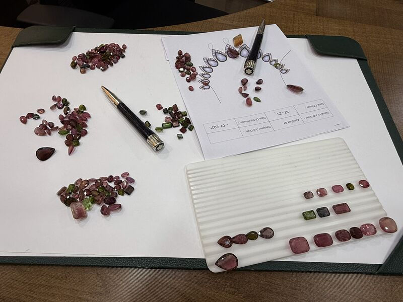
Today, as I work with the rich, vibrant spectrum of multi-tourmaline to design an exclusive set for the bride’s mother, I’m reminded how colour bridges emotion and intention. This isn’t just about matching stones—this is about expressing grace, legacy, and quiet strength in a palette.
Years of colour study and countless combinations have trained my eye—but more importantly, they’ve trained my heart to feel what colours truly mean.
Master colour, and you master perception. And in the end, that perception becomes product love.


Comments